Friday, May 21, 2010
Final Project: Water Polo Game
Yes, I admit I got inspiration from my digital Final Project, but, even then, I personally think it turned out amazing. I'm sure my digital project helped me find the best images, but, in the end, I think my digital final was better. Digital just has a very large buffer space for bad pictures, plus the ability to see the actual image without having to process film. Plus you can delete it if it is bad. You can do none of this with film, but this is about my film, so that's what I'll talk about. First off, I would like to give some back story to this game. This game was my little sister's junior varsity championship match, and I had to say I was a photographer for the team to get in with all of my equipment. Due to the fact we were early to the game, I shot some of the game before as well. It was men's varsity 3rd place match. But, back to the project, I think every one of my images are very strong and help tell the story. There is a good variety in my images, telling the story about everything instead of focusing on just the players or just the coaches. Even without special sports shooting equipment, the images still turned out just fine. My personal favorite is the one of the dive tank with two balls on it. The toning for it turned out perfectly and the image is very strong. The soft edge is not really detracting from the image, and it is one of my best images. Another one of my favorites is the team jumping in. The toning for it worked well for the image, and the image was strong already. The others worked well for the story of a game. The image of the fight over the ball was very telling of the fact water polo is, in fact, a contact sport. It is a telling image, and the lighter toning for it brings out the warm feeling of an outdoor pool in summer, even if it was shot in the spring. A second telling image is the team photo with the trophy. Again with the summer toning, even though it is the smallest bit overdone, and the fact it was taken from the side instead of the front, where they were posing, lead to a strong and definitely different image. This assignment was a great chance for me to come out and shine. I also think the Saturday lab session was a real savior for this, plus the fact I gave myself time to tone. You really need to put more of those in, you might be surprised at the results. But, in conclusion, this was my best assignment ever in film. They do say to go out with a bang, so, good-bye photo, been nice knowing ya.

Thursday, May 6, 2010
Photographer Research: Lucian Perkins
Lucian began photographing in collage at the University of Texas. After graduating, he returned to the University of Texas to teach. While teaching, he studied photography under Garry Winogrand. After this, he took an internship at The Washington Post. He stayed there for 27 years. Shortly after joining, his interest in shooting international conflicts grew. He won "News Photographer of the Year" for his shooting in Russia, plus some fashion photography. Related subjects, no? He also won a Pulitzer Prize for a four year project on the effects of poverty and crime on a family living in Washington D.C. He won a second for a portfolio of Kosovo refugees. The Kosovo Conflict was a very personal time in my life. My father was in the Air Force during this, and he was sent over to fly refueling tankers. Because this photographer shot the conflict, it was one of the reasons I selected him to research. He tends to focus on people, mainly refugees and military members. He now works as a freelance photographer in D.C.
 This image is the one which made him famous. It is of a refugee boy staring out of the back of a bus. This image helped him win a Pulitzer, and characterizes the Kosovo Conflict in a picture. The child has nowhere to go, because his home is destroyed or he is being hunted. The pure hopelessness in the child shows the state of Kosovo after Milosevic and and the NATO bombing. From the looks of it, he is trying to break out of this decending spiral the war pushed him into. It is not working. It is a true war photograph. It shows the actual face of war, no propoganda what-so-ever.
 This is one of the oddest photographs I have ever commented on. Blinky, from pacman walks down the street on Halloween. Sounds like something which would show up at my family's Halloween party. I can see nothing wrong with the composition. While this image may not relate to th overall topic of most of his images, which is war, it's just funny.
 This is one of the photographs which allowed him to be accepted as an intern for The Washington Post. The woman was one of the first group of female seniors in the United States Navel Academy. This image shows the senior woman chewing out a group of freshman, in this case for messing up the menu. Lucian was able to take a shot at a very historic point for the academy. The first co-ed class in the 132 years of the school, it was a turning point for women in the military. The composition is perfect. It must be easy to shoot stock-still recruits in white uniforms. They look almost scared.
Tuesday, May 4, 2010
Assignment 7: Life and Death
This assignment was a bit odd for me. I eventually decided on my favorite place to shoot, the pool. The lifeguard room and the scenery at the pool and center provided a good place to take pictures. The light was good and I was able to get some pretty good shots in. The weird part was my camera rewound the film before I shot all 36 frames. This left me with a bit of a shortage of images to use for the project, but I pulled through. My personal favorite is the close-up of the tree branch. The light from over the building represents hope and life from above. The rest of the tree is the rest of the world, filled with life, but the branch is the most important. The branch is the sole individualism of life, standing out from all the others. Just a symbolic picture in my mind. The contrast of the trunk is absolutely phenomenal, and I do not think the light could have been better. Another interesting occurrence was the glare on the Pool Rules sign. Rules keep you safe, they keep you alive, and they have a spirit to them. The glare on the sign acts as that spirit in the picture. I will admit it is slightly blurred, but still it is a very interesting picture. Not my best, best work in the world, but it hits the top ten on my assignment list. I could not hit the creative milestone the "Fish Out of Water" allowed me to make, but I still rather enjoyed it.
Wednesday, April 28, 2010
Assignment 6: Fish out of Water
This, I must say, was my favorite assignment we have done this term. It gave us a good chance to let some creativity loose which we had not done too much before. I took this assignment like I took the portraits in Slade's class. When I got this assignment, I had two thoughts: 1. The definition of "Fish out of Water" 2. My portrait assignment. I let my creativity from that spill over into this assignment, and it worked. All of my pictures turned out amazing, but my favorite is the rifle bullet in the group of shotgun shells. Because the table it was shot on (no pun intended) had a glass top, it almost looked like they were floating. Also another one of my favorites was the six bullets with the bullets still there, with the shot one in the center. It was shot on the same table, but has a different effect because of the angle. Also the blurred background from the focus gives one of the most interesting background for any of my pictures. I got that part right from the portraits. This is some of my best work ever.
Friday, April 16, 2010
Assignment 5, Contrast
This assignment was challenging to say the least. The low contrast was the hardest by far. The normal high contrast was fun, but trying to get it to have "normal" contrast was a nightmare. The low contrast was kinda' easy and worked out well, but trying to fix the contrast was near impossible. But, after everything, they came out as good as they are going to get from me, and I will just try to not mess with the laws of contrast, along with physics. Not too good of laws to mess around with. I personally like the normal high contrast ones the best, and thanks for finally giving us a chance to shoot another roll.
Thursday, April 1, 2010
Assignment #3 Journal
My pictures for this assignment did not like the toning process. While a couple had a big change, most of them did not seem to change at all. The NT sephia and the WT poly had some big effect, which I liked, but the rest did not seem to change much. I believe the NT and WT selenium somewhat increased the contrast, but it was rather hard to tell. On the other hand I had an enjoyable time with the toning, and maybe I'll try again sometime. But for now I will leave the toning to the people who have trained for it.
Monday, March 22, 2010
Journal Entry #2
My prints came out better than my first assignment, less rushed, as you said. The technical components are all in place and the assignment is completed. I cannot really discern a difference between the LPD and Sprint developers, but I do see big differences in the paper types. I like the warm-tone paper because of the yellow tint it gave to the print, and it made the prints somewhat better to look at. The prints are all in focus, with correct times and filters, and it should be my best work of the year so far.
Monday, February 15, 2010
Yevgeny Khaldei
For my research assignment, I chose this WWII Russian photographer. He was born to a Jewish family in present day Ukraine. He built his first camera out of his grandmother's glasses. He first started working at a Russian broadcasting company named TASS as a press photographer. He shot in World War II as a Red Army photographer from 1941 to 1946, recognized for shooting multiple famous events such as the capture of the Reichstag and the Nuremburg Trials. He also shot many of the great Russian leaders such as Stalin, Gorbachev, and Yeltsin. His images are war camera quality, and they have very good composition giving off very strong vibes and powerful images.

This is the image which made Yevgeny famous. It is Russian soldiers raising a flag atop the newly captured Reichstag building. This is actually a recreation of the flag raising. A flag was raised the day before, but it was taken down by Nazi fighters in the building. Sound familiar? Iwo Jima, anyone? Anyway, it is also very strong in the composition and the message it gives. It gives a "We have fought long and hard for this place, and it is now ours" through very symbolic means. It was also an image which was ridiculously photoshopped for content. Just like the cigarette in one of the Beatles famous album covers. They took out a looted watch to make it look like they had not been looting the place, replaced the flag with a more dramatic one, added smoke for effect, all courtesy of the Russian FCC. All in all, it is a wonderfully created image, and my favorite of the bunch.
 I like this image because it gives a vibe of reconstruction and a return to the normal. The three people are just sitting there, possibly on a beach, relaxing even with the remnants of the war sitting right behind them. It shows how people can adapt for any situation, any time, and make the best of it. Not my favorite image of the bunch, but it is still nice.
 This is three political leaders lounging around, from left to right: Churchhill, Truman, and Stalin. This image is a famous one taken at the Potsdam Conference in Germany during July 1945. During a small break of the meeting, the leaders settled down for an impromptu photo session. It shows how the war is fought on two fronts. The commonly seen army front, but also the political front with the world's leaders battling with words. The focus is perfect, but it is hard, at first glance, to see the faces and distinguish who they really are. I could see Stalin in an instant, but Truman and Churchhill are a bit hard to make out. Might be just me.
 I like this image because of the amazing composition and the strength of the image. It shows an officer with only one leg and a civilian , possibly his wife. He shows how everybody is a casualty of war, not just the armies. The armies lose massive amounts of men, and the civilians lose their cities, economies, and production capabilities. He shows these losses through this image, the lost leg, the rebuilding in the background, the bleakness of the people, but also the light of rebuilding.
Tuesday, January 12, 2010
Final Project: Swim Meets
"On my last day on earth, take me to a swim meet, because they last forever!" -T-shirt
This inspiring quote is what I based my final project on. After a slew of swim meets over the break and the last week, I have managed to capture the heat and excitement of it all.
 This and the next picture are about the necessary equipment for swimming competitively. You would not play football without a helmet, would not play golf without a ball, I won't go to a swim meet without this stuff. This first one is a bit bland with the light, but it is the perfect image to show the normal outerwear for a meet, all poised on a pair of deer horns. The jacket and pants are vital to stay warm in the wintertime, and of course you need to have a suit. Not the most creative or visionary picture ever, but it works.
The other half of the equipment, the bag of hope, doom, and swim stuff. This is the first thing anyone sees once they go into my house. It shows dedication, and shows we are swimmers. The towel and the unseen goggles are just as important as anything else on the equipment list. The light is decent, but the focus is good, so I am happy with it.
 This image, taken at Kearns Oquirrh Park Fitness Center, is a vertical panorama showing the length of the pool during a breaststroke event. I like how the one girl is seen turning at the wall, but then seen later on in the pool. The girl is blurry, but it shows how swimming is a sport of motion, not static aggression being released. Everything else is in focus, thank goodness, and I love the reflection of the windows on the pool.
 This is the same pool, taken from a different angle on top of the bleachers they have. I like how I got not only the pool, but also the (rather small, but this was the 1000 free night) crowd. It shows how swim meets are not just about the pool or the swimmers, rather the community spirit made from the crowd, all gathered to watch and cheer for their team or swimmer. Pretty symbolic. And it is in focus. Yay.
 This image is my second favorite of the bunch. This is a member of the Brighton High swim team getting ready for a race. Funny thing about this, I shot this freehand with no prep. I moved the camera the same pace as him, and the slower shutter speed did the rest. Lucky me. Regardless of my last paragraph, swim meets revolve around the swimmer, and this image captures just that. Everything around him is blurry, not important, but he is in sharp contrast to the rest of the image. I knew that 4-leaf clover was good for something.
 This is the diving tank/ warm-up pool at Cottonwood Heights during a dual meet. It is actually a smaller pool than it looks like from the image. This is a behind the scenes shot for swim meets. You hear about the record breaking times and about how fast people are going, but there is plenty of unseen work going on out there. You cannot just go out there without warming up first, but it goes unseen. All of the people in the background are looking at the main pool, while the swimmers are preparing. This image is a tribute to all of this work.
 This is another one of those shots focusing on the swimmer himself, but this time the crowds are there, giving the sense of a whirl of commotion all leading back to the swimmer. The swimmer in the middle, with the bright towel really jumps out, and he is in the perfect place. I thank steam for the depth of this image and the back story for the next one.
 This is the tribute to why you DO NOT shoot in an enclosed pool for extended periods of time. Steam was my biggest enemy by the end of this project, but it added another layer of challenge to the assignment. How do you work around steam? Or can you use it to your advantage? Not the most interesting picture ever, but it shows the challenges of pool photography. Can you see the lens? Hint: it looks like an eye.
 This, I must say, is my favorite image of the bunch. It captures the two contrasting sides of a swim meet. This is the picture of the beginning of the third leg of a relay, so that is why there are two girls at once. They show the action part. The go go go and the fire filled drive of the swimmers during a race. The other half is the calm, serene side. You have a good two hours before your next race, so you relax like the girls in the blue swimsuits. Both sides are a major part of swim meets, so you learn to deal with them both. I also like how the shutter speed is an equilibrium between the two. The action side is blurred with motion, but the calm side is frozen. Some of my best work here.
Friday, December 18, 2009
Assignment 7: Panoramas
First off, i really liked this assignment. It was really fun to shoot these and i think mine turned out quite well. Being able to capture all of these unique shots you cannot get with just one frame really is quite cool.
 This is the diving tank/makeshift pool at cottonwood heights. I love how the swimmers are blurry, it shows how swimming is a sport of motion. The picture is even in focus. This has to be one of my better images.
 This must be my favorite image of them all. I "hired" two girls from the swim team to just act natural on different portions of the bleachers and this is what came out. I LOVE the light on the first couple on the far left, and i like the flying scarf on the last one. It's great how in-focus it is and how it really tells three different stories in one picture. If you can't tell, they are the same two girls in all three couples.
 Missing: Vertical panorama, technical difficulties
Thursday, December 17, 2009
Final Project: Swim Meets
For my final project, I will dive into the watery world of swim meets.
[Will add more]
Friday, December 11, 2009
Assignment 5: Random objects
Well, I figured out what happened to my assignment and why I have a zero on it. I just didn't blog about it, so this is what I do now for you. This is just shooting random objects you find around your house or wherever you find yourself.
 This happens to be a swim bag. This image is in focus, thank you Mr. Slade for the lesson, but this particular image would have been very hard to shoot out of focus. Ironic, huh? Well anyway, you can see the texture quite clearly and the image managed to hold itself together.
 This is a Halloween decoration taped to a window in my home. I love how the spider looks like it's about to eat the tree in the background. We all knew giant spiders would destroy the world. The spider is in focus, but the window pane in the corner is bugging the crap out of me. (No pun intended) All in all, a pretty decent image
 I should have spent a bit more time with this. It is in focus, but the background is kind of distracting and the light is a bit funny. In conclusion, has unrealized potential.
 This is just a bunch of magnetic stick figures stuck to the door. It is slightly out of focus, and is kind of boring, no real selling point. Not best image ever
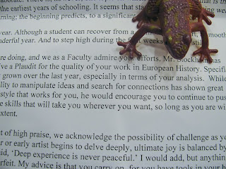 This is my favorite one of the bunch. I found this one just randomly one day when I was just playing with the frog and it landed on my plaudit from my history class. It is in perfect focus, and is one of the most interesting pictures I have ever taken. A+ grade picture here.
 Crocodile shall rule the world. FEAR HIM...even if he is slightly out of focus. Not the best image ever, but it is halfway decent and works for this assignment.
 This happens to be a swim bag. This image is in focus, thank you Mr. Slade for the lesson, but this particular image would have been very hard to shoot out of focus. Ironic, huh? Well anyway, you can see the texture quite clearly and the image managed to hold itself together.
 This is a Halloween decoration taped to a window in my home. I love how the spider looks like it's about to eat the tree in the background. We all knew giant spiders would destroy the world. The spider is in focus, but the window pane in the corner is bugging the crap out of me. (No pun intended) All in all, a pretty decent image
 I should have spent a bit more time with this. It is in focus, but the background is kind of distracting and the light is a bit funny. In conclusion, has unrealized potential.
 This is just a bunch of magnetic stick figures stuck to the door. It is slightly out of focus, and is kind of boring, no real selling point. Not best image ever
 This is my favorite one of the bunch. I found this one just randomly one day when I was just playing with the frog and it landed on my plaudit from my history class. It is in perfect focus, and is one of the most interesting pictures I have ever taken. A+ grade picture here.
 Crocodile shall rule the world. FEAR HIM...even if he is slightly out of focus. Not the best image ever, but it is halfway decent and works for this assignment.
Tuesday, December 8, 2009
My First Panorama

My first panorama which did not get mangled in the merging process. This is the blocks at the local rec center. The center really bulges, but I think that is natural. It really turned out nice.
Wednesday, November 18, 2009
Assignment 6, Portraits
I really liked this assignment. Anytime I get to wear my Russian outfit is a good time, but I think I got a bit carried away, though. I like how I am in focus in most of these shots, even with my sister shooting. I had to crop out my cabinet in most shots, but they still turned out quite well. Next time I need to give myself a bit more time, and I should give my sister a lesson in cameratology.

This is my creepy sister making a face at me. It has good focus, but the white below her eye is blown out. The background is a bit distracting, but the light is decent. This has more potential, but it turned out alright.

I like this because of the energy it is giving off. I am mostly in focus, but my hands are pretty blurry and clipped off. The sword is blurry, but it gives off a motion feel, like I am swinging the sword. The light is also just plain dead. Better than some of my previous work, though.
 I LOVE this image. I am in perfect focus, and I give off such power. The hero angle is perfect for this shot. There are just a few things I would fix, though. I would stand a bit more to my right, even out the spaces, and I would put some more light on the front of me. But I think this was the best one of the bunch.
 This one could have been better. Again with the dead light, and the focus is off. The yell is pretty fake, but it is still a powerful picture. Just need to re-shoot it with some different light.
 I love this one too. I am in focus, but the gun is blurry. The look on my face is perfect for the image. Again with the dead light, Danial is coming over the next time I do this. There is so much power coming off of this image, and I love it.
 Getting tired of seeing me yet? Apparently I was the only one who took to many self-portraits and not enough portraits of other people. Messed up, right? Well anyway again with dead light, but I think I might just have gotten focus down. Yay.
 I like this one because it shows how our dog is the boss of the house, and everyone else is behind him. He fell asleep during this, but still it is in focus, and is very powerful. Great shot, but STILL is with the dead light. Will work on that in future.

This is my creepy sister making a face at me. It has good focus, but the white below her eye is blown out. The background is a bit distracting, but the light is decent. This has more potential, but it turned out alright.

I like this because of the energy it is giving off. I am mostly in focus, but my hands are pretty blurry and clipped off. The sword is blurry, but it gives off a motion feel, like I am swinging the sword. The light is also just plain dead. Better than some of my previous work, though.
 I LOVE this image. I am in perfect focus, and I give off such power. The hero angle is perfect for this shot. There are just a few things I would fix, though. I would stand a bit more to my right, even out the spaces, and I would put some more light on the front of me. But I think this was the best one of the bunch.
 This one could have been better. Again with the dead light, and the focus is off. The yell is pretty fake, but it is still a powerful picture. Just need to re-shoot it with some different light.
 I love this one too. I am in focus, but the gun is blurry. The look on my face is perfect for the image. Again with the dead light, Danial is coming over the next time I do this. There is so much power coming off of this image, and I love it.
 Getting tired of seeing me yet? Apparently I was the only one who took to many self-portraits and not enough portraits of other people. Messed up, right? Well anyway again with dead light, but I think I might just have gotten focus down. Yay.
 I like this one because it shows how our dog is the boss of the house, and everyone else is behind him. He fell asleep during this, but still it is in focus, and is very powerful. Great shot, but STILL is with the dead light. Will work on that in future.
Thursday, November 12, 2009

Tuesday, November 10, 2009


Tuesday, November 3, 2009
Halloween Assignment
This is my time at the graveyard. I'm glad I brought my camera, because some weird stuff started to happen. I saw a few ghosts there, and they were acting quite strangely.

This first ghost was actually playing golf in the graveyard. With my 8 sec exposure, I caught him teeing off on the first grave. I love how everything besides the ghost is in focus, and how I caught the entire swing. So graceful.

I absolutely LOVE this image. Everything is in focus, and, you may need to look a bit for it, the ghost is the absolute best thing on the planet. Psst, look to the left of the graves. Were those flowers there before?

This first ghost was actually playing golf in the graveyard. With my 8 sec exposure, I caught him teeing off on the first grave. I love how everything besides the ghost is in focus, and how I caught the entire swing. So graceful.

I absolutely LOVE this image. Everything is in focus, and, you may need to look a bit for it, the ghost is the absolute best thing on the planet. Psst, look to the left of the graves. Were those flowers there before?
Thursday, October 22, 2009
Assignment 2 1/2, before and after

This is the before. There are no true blacks and the glare really, really, bright.

I toned down the white and brought out the true blacks in this. The entire thing toned down and I got more detail from the stuff in the machine. It worked.
Assignment 3, Part 3

This is my air hockey table in my basement. I LOVE the fact one of the holes is in perfect focus and the reflection give character to the image.

This is kinda bland. It is not in focus, and the coffee stain is messing it up. It is monochromatic, but not the best example
Assignment 3, Part 2

This is my bed cover, and about halve of it is in focus. It is perfect monochromatic and it just works, capish?

This, had it been in focus, and had i not needed to crop out a small portion, would be an excellent picture. It is the underside of a bunch of orange clothes, and it gives many shades of the same orange.

This was an amazing picture, and a small part of it is in focus. It is the same clothes, and it is so close to an amazing perfection.
Subscribe to:
Posts (Atom)
